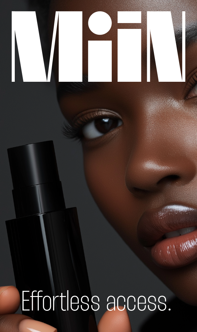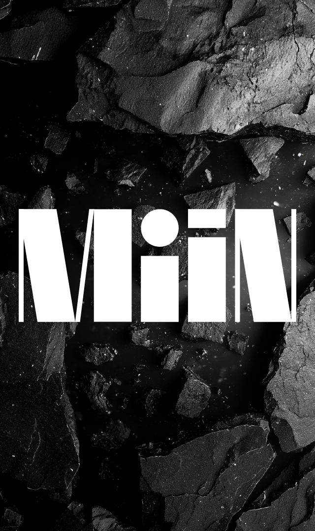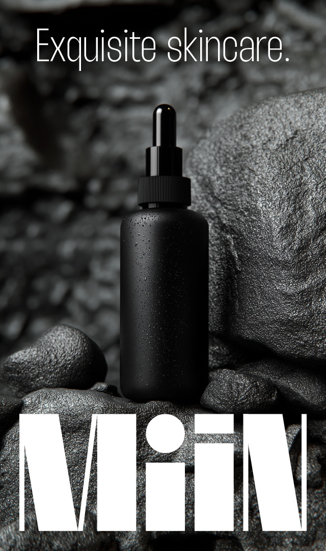


MiiN is a Brazilian brand that makes Asian beauty products accessible, bringing the most sophisticated and sought-after skincare solutions to the national market. The brand identity was developed to reflect this mission, combining minimalism, modularity, and an organized aesthetic. The logo, thoughtfully designed, features a unique characteristic: the "i" letters resemble the silhouettes of beauty product bottles, creating an immediate visual connection to the cosmetics industry. This detail adds personality and identity to the logo, reinforcing the brand’s association with its products and purpose. The modular and clean design harmonizes with MiiN's concept, delivering an organized, intuitive, and straightforward experience. The logo’s modularity and the visual identity evoke a sense of organization, tags, and categorization, making it easy for consumers to navigate and find products. Every visual element was crafted to be sophisticated yet practical, embodying MiiN’s commitment to both organization and accessibility. MiiN brings the best of Asian cosmetics to Brazil with a visual experience that mirrors the simplicity and elegance of these products, making the shopping process easy and enjoyable.
